
Search is one of internets biggest problems.
Quoting Peter Moville and Jeffrey Callendar in their book Search Patterns:
“Search is a defining element of the user experience… Unfortunately, it’s also the source of endless frustration. Search is the worst usability problem on the Web.”
Google is one of the world’s most valuable companies by providing a solution to this problem
“our mission has always been to organize the world’s information and make it universally accessible and useful.”
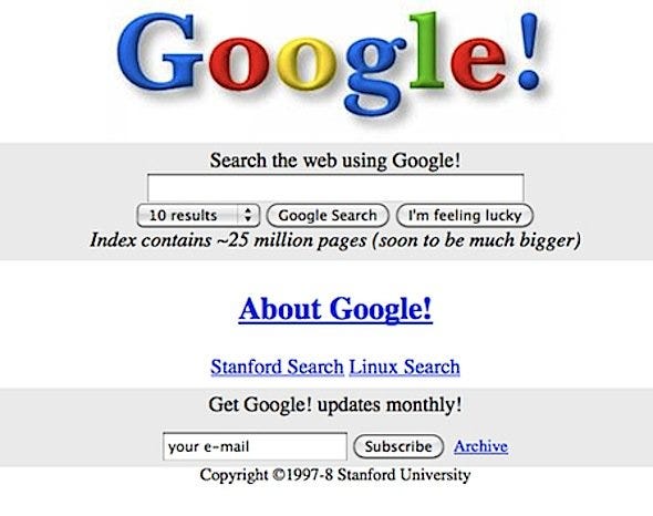
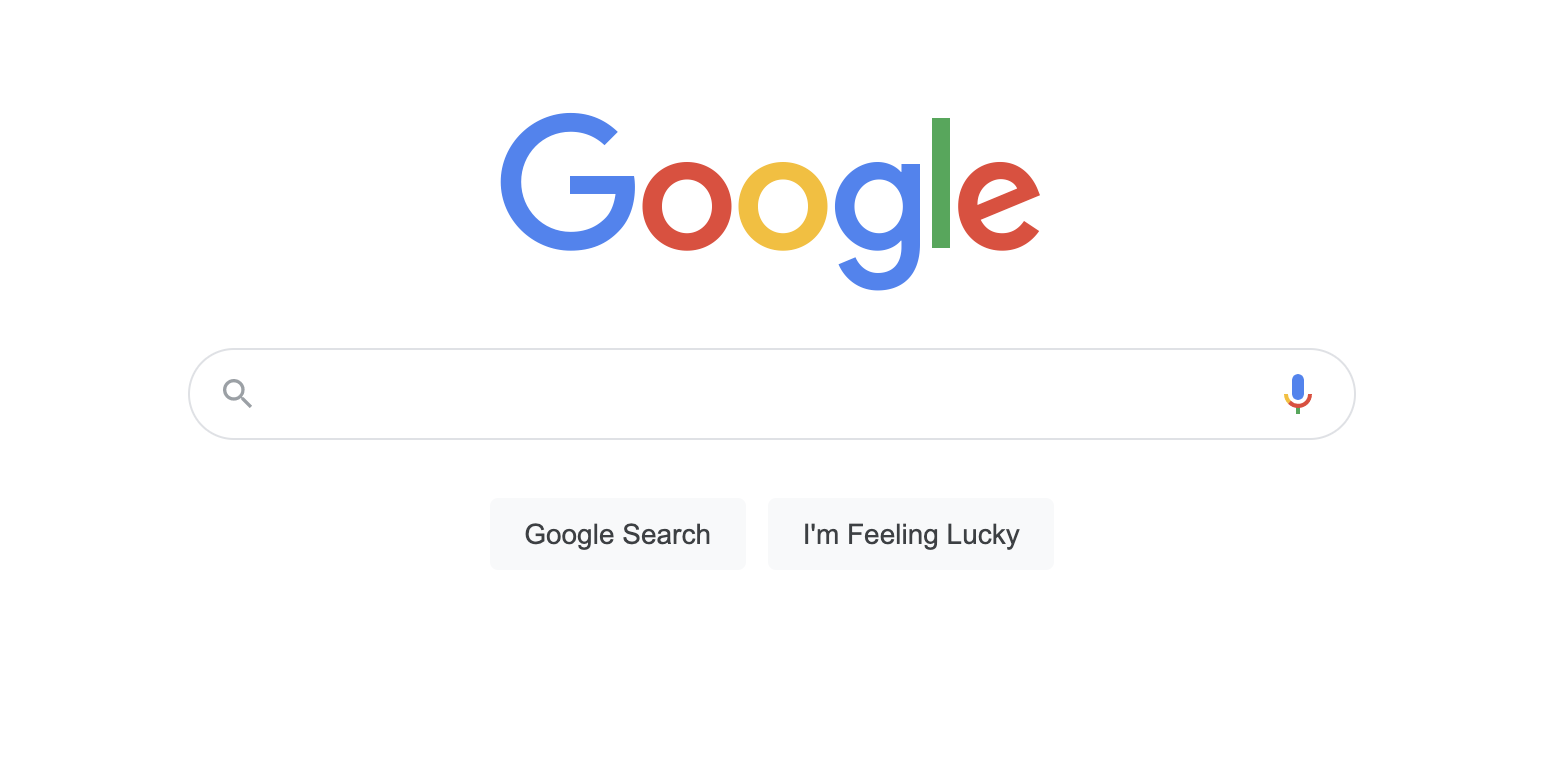
It’s amazing that google hasn’t changed much in 20 years while the internet has gone through enormous changes. One of the main ways they have changed is by taking things away instead of adding things – which is an important thing to learn.
So discovery is an extremely important part of websites. How do users find the information they need?
Thats a really important part of China Admissions. Students to be able to search easily, quickly, and find the relevant information so they can find the information they need to make a decision and apply.
In this article I am looking at different solutions and seeking to learn the principles to design an awesome search experience.
On China Admissions students will need to search for the following:
– Programs
– Universities
– Articles / Topics
– Answers to their questions
What are the main principles of making search an amazing experience for users? Is search even necessary? If you don’t have many pages it might not be necessary. If it is, then put it on every page.
– Make it noticeable and clear
– Put it on every page
– Use the magnifying glass icon to show it is search
Search Vs Browsing
There are two ways to find information, the first is search and the other is browsing – by clicking through categories. It is important to consider the use cage and how users might want to use one vs the other. They can both be offered to improve the experience and empower our users
What are your searching?
It’s important to consider what exactly you are searching? That would influence the whole experience. If there are many different things then you need to arrange that in the results too.
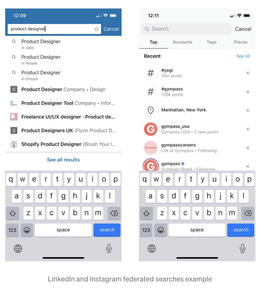
Linkedin and Instagram will search everything and then you can refine from there according to the category.
One search vs two search bars. It might be necessary to give multiple filters or drop downs depending on the case.
Mobile Vs Desktop Search
Are your users using mobile or desktop? Its better practice to focus on mobile but important to consider the differences in two different experiences.
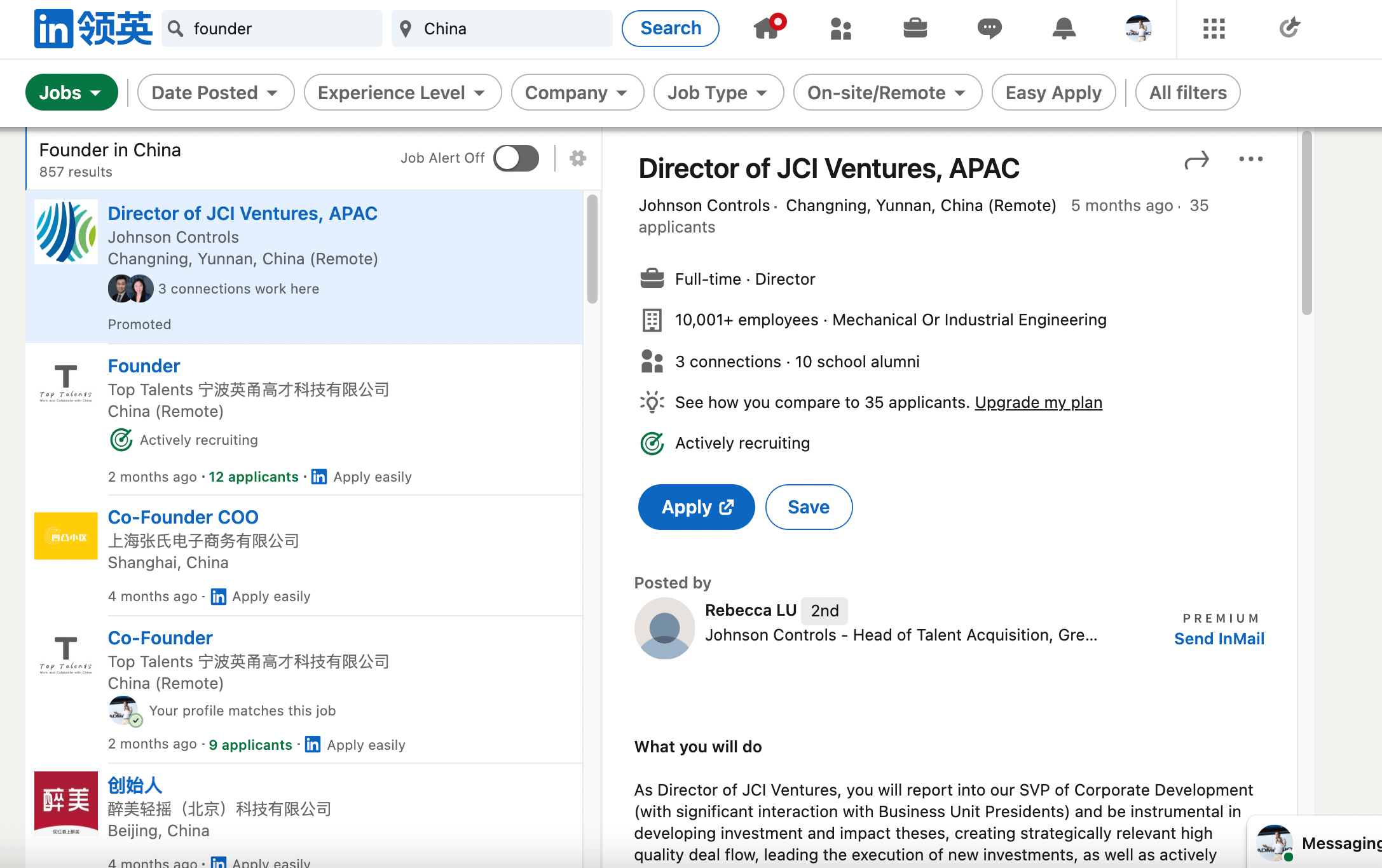
I really like the Linkedin job search. It basically creates the mobile view of search results, and the job page and then combines two mobile views onto one view. Its quite an elegant solution to search because otherwise users will want to open multiple tabs to go through the results.
Auto Suggest
– It’s a great idea to show users options before they search so they might not even need to search.
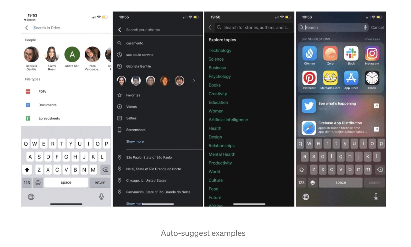
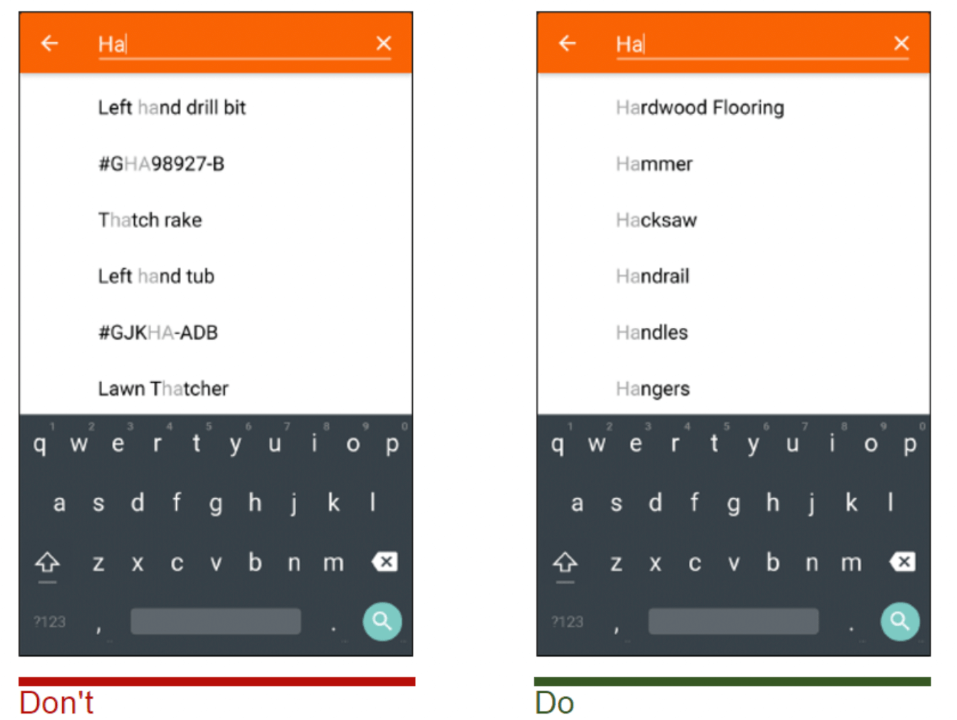
– Use an auto-suggest – to make it easier for searchers. Poorly designed auto-suggestions can confuse and distract users. Thus, use spelling auto-corrections, recognition of root words, and predictive text in order to improve the tool.
Present less than 10 items in the list of suggestions (and without a scrollbar) so the information doesn’t become overwhelming.
Allow for keyboard navigation for the list of suggestions. Once a user scrolls down past the last item, they should return to the top of the list. The Esc key should allow users to exit the list.
Highlight differences between the inputted information and suggested information. For example, the input text might have a standard weight, while suggested terms are bolded.
Enhance the feature by adding image previews of the items along with text description.
Search Results
This is an extremely part of the search experience.
– Show search results immediately – the faster the better. Otherwise it can show that it is loading.
– If it takes a long time then a beautiful animation can help to distract users and keep them interested and create a pleasant experience.

This might be annoying, but there might be some other kind of animation that can be shown that fits with the brand and user experience. But Its definitely better to just try and get really fast load times in the first instance!
– How much information to show? What is needed for the user to make a decision? Give them the ability to switch between grid and row view.
- No results – should show related or similar results and actions for the user.
- Filter and Sort Options are important to help refine the experience
Analysing the Data
Its really important to analyse the data of users and see how they interact with the search. It’s never complete. Two tools to use are:
– Google Analytics – Using google analytics to track search terms and how users interact with the site
– Microsoft Clarity – to anonymously watch users interacting with the search page and subsequent pages.
– Asking people to use your search and seeking feedback from people in real life
Further Resources
This is quite a brief article and there is so much more to learn about search.
If you want to learn more about search, then I recommend the world’s leading search engine Google.
Here are some other recommended resources:
– https://uxdesign.cc/ux-for-search-101%EF%B8%8F-2ab4b2f2384d
– https://www.nngroup.com/articles/search-visible-and-simple/
– https://uxplanet.org/user-experience-of-search-bar-a004656f04d2
– https://uxplanet.org/search-interface-20-things-to-consider-4b1466e98881
– https://www.coveo.com/en/resources/ebooks/search-user-experience-guide
– https://www.algolia.com/blog/ux/7-examples-of-great-site-search-ui/
– https://careerfoundry.com/en/blog/ui-design/how-to-design-a-good-search-experience/
Pingback: The Movie Discovery Problem - how to solve this? - Richard Coward